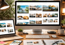

A half-finished WordPress site with mismatched fonts, random spacing, and two different button styles on the same page. Sound familiar? That frustration hits hardest when every page is supposed to look polished.
Design consistency with templates is the difference between a site that feels professional and one that feels stitched together. But the fix is simpler than you think.
The problem usually starts before a single page gets built. It begins the moment someone picks a theme, skips the global settings, and starts dragging blocks around with no plan.
This one is for the solo builder or small business owner running WordPress without a dedicated designer on call.
Picking a WordPress Theme That Locks Down Your Visual Rules
The theme decision matters more than the builder decision. That might sound backwards, but a theme controls your baseline: default fonts, spacing logic, color inheritance, and how templates behave across pages.
Astra, GeneratePress, and Kadence are the three names that come up constantly. All three are lightweight and customizable. But they handle consistency differently.
Why Kadence and GeneratePress Handle Global Styles Better Than Astra
I think Astra’s massive template library is a trap for design consistency. The starter templates look great individually, but they were designed by different teams with different spacing rules, different button styles, and different heading hierarchies.

Mixing two Astra starter templates on the same site almost always creates visual clashes. Kadence and GeneratePress offer fewer prebuilt options, but the ones they include share a tighter design logic. Fewer choices, cleaner results.
The WordPress Full Site Editor (FSE) has improved dramatically for theme-level control in 2026. Block themes built for FSE let you define global styles once: typography, colors, spacing, and button treatments.
Those rules then cascade across every template. If your theme supports FSE, that is where consistency starts. Check the WordPress Full Site Editing documentation for the full breakdown of global settings.

Build One Full Page Before Setting Global Styles
The standard advice says to configure your Customizer settings first, then build pages. I disagree. Setting fonts, spacing, and colors in a vacuum leads to constant revisions once real content hits the page.
A heading that looks clean at 32px in the Customizer might feel oversized next to a 400-word paragraph with an embedded image.
Build one complete page first. Put real text in it. Add your images, a CTA button, a testimonial block, and a footer. Then look at what works.
Extract those typography sizes, spacing values, and color choices into your global settings. Now your rules come from real design decisions, not abstract guesses.
Setting a Color Palette and Typography System That Sticks
Color and font choices seem obvious, but they break consistency in sneaky ways. The issue is rarely choosing the wrong palette. The issue is applying it inconsistently.
The 2-3 Brand Colors Rule
Stick with 2 to 3 brand colors and 2 neutrals. That is it. Every background, button, heading accent, and link color should pull from this set. Tools like Coolors let you generate and lock a palette in minutes.
The common mistake here: grabbing a hex code that is “close enough” instead of copying the exact value. A #2563EB blue button on the homepage and a #3B82F6 blue button on the pricing page look like two different brands.
Store your hex codes in a shared document or style guide. Copy and paste them. Never eyeball it.
Typography Rules for Headings and Body Text
Assign one font for headings and one for body text. Set sizes, weights, and line-height values for H1 through H4, paragraph text, and small/caption text.
The spacing between a heading and the paragraph below it should be identical on every page. A 24px gap on the About page and a 16px gap on the Services page creates a subtle wrongness that visitors feel but cannot name.
If the builder supports it, use global typography settings rather than inline styling. Elementor, Gutenberg, and Bricks all have site-wide typography controls. Inline font changes on individual pages are the fastest path to a messy site.
Also read: Website Builders for Business Websites
Spacing, Layout, and the Builder Consistency Problem
This is where design consistency with templates either holds or collapses. Two pages can share the same colors and fonts but still look like different websites because of inconsistent spacing and layout structure.
Defining Base Spacing Units
Pick a base spacing unit and use it everywhere. A common approach: 8px as the base, then scale in multiples. Section padding becomes 48px or 64px. Element gaps become 16px or 24px. Card padding stays at 24px.
This matters more than it sounds. When spacing is improvised page by page, your site develops a visual drift that gets worse with every new page added. A spacing system prevents that drift.
Some things that should use identical spacing across the entire site:
- Section padding (top and bottom of every full-width section)
- Card and content block internal padding
- Gap between heading and first paragraph
- Margins around images and embedded media
Stick to One Page Builder
Mixing builders is the single fastest way to destroy consistency. Elementor renders CSS one way. Gutenberg renders it differently.
Bricks has its own logic. Running two builders on the same site creates conflicting stylesheets, different spacing defaults, and inconsistent responsive behavior.
Pick one. Learn its global controls. Elementor has Site Settings. Gutenberg has the Site Editor. Bricks has its global classes system.
Every builder has a way to set rules once and inherit them. The problem is that people ignore these systems and style each page individually.
| Feature | Elementor | Gutenberg (FSE) | Bricks |
|---|---|---|---|
| Global Colors | Site Settings panel | Global Styles | Theme Styles |
| Global Typography | Site Settings panel | Global Styles | Theme Styles |
| Reusable Sections | Saved Templates | Reusable Blocks / Patterns | Template system |
| CSS Handling | Inline + external | Block-level styles | BEM-style classes |
Bricks handles CSS most cleanly through its class-based system, but Gutenberg’s FSE approach has the smallest performance overhead since it uses native WordPress architecture.
Reusable Blocks and the Case for Building a Mini Design System
Templates work best when they pull from a library of pre-styled components. Think of it as building a small design system inside WordPress.
Global Blocks Save Time and Prevent Drift
Save your header, footer, CTA sections, testimonial blocks, and pricing tables as reusable global blocks. When a button style needs updating, change it once in the global block. The update flows across every page that uses it.
The alternative: manually editing the button on 14 different pages and forgetting to update page 15. That one missed page becomes the inconsistency a visitor notices.
Plugins that help manage block reuse and styling control:
- Stackable: adds consistent block styling options for Gutenberg
- Ultimate Addons for Elementor: adds layout controls and design presets
- WP Reusable Blocks Extended: organizes and manages reusable block templates
Header and Footer Uniformity
Headers and footers are the elements visitors see on every single page. A logo that shifts 4px between the homepage and the blog, or a footer background that changes shade, creates an immediate feeling that something is off.
Use your theme builder or a plugin like Elementor Pro’s Theme Builder to assign a single header and a single footer globally. Avoid editing headers or footers on individual pages unless a specific landing page requires a stripped-down version.
Checking Design Consistency on Mobile and Running Audits
Desktop consistency is only half the job. A template that looks perfectly aligned at 1440px wide can break at 768px or 375px if responsive spacing has not been configured.
Mobile Responsive Checks for Every Template
Test every template at three breakpoints: tablet (768px), large phone (414px), and small phone (375px). Pay attention to these specific things:
- CTA button size and tap targets (minimum 44px height for mobile)
- Font sizes that looked fine on desktop but feel enormous on mobile
- Image aspect ratios that stretch or crop differently on smaller screens
- Section padding that creates too much whitespace on phone screens
WordPress preview modes show a basic view, but browser DevTools give more accurate results. Chrome’s device toolbar with a real pixel width is the better test.
Monthly Design Audit Checklist
Run a quick audit once a month. Open 5 random pages and compare them side by side. Check font sizes, heading styles, button colors, card padding, and image treatments. If something drifts, fix it before adding new pages.
A living site picks up inconsistencies over time. Blog posts get styled differently depending on who published them. Landing pages get one-off tweaks that stick around. A monthly check catches those before they multiply.
Questions People Ask About Design Consistency With Templates
Q: How many fonts should I use on a WordPress site for consistent design? Two fonts is the sweet spot: one for headings and one for body text. Adding a third font creates visual noise that makes pages feel disconnected, especially across different templates.
Q: Can I use multiple page builders and still maintain design consistency? Technically yes, but the effort required is not worth it. Each builder generates CSS differently, so matching spacing, fonts, and button styles between Elementor and Gutenberg on the same site takes constant manual correction.
Q: How often should I audit my WordPress site for design inconsistencies? Once a month is a good baseline. Open five random pages, compare heading sizes, button styles, spacing, and image treatments. Catch drift early before it compounds across dozens of pages.
Q: Do I need a style guide for a small WordPress site? Even a one-page document listing your hex codes, font sizes, spacing values, and button styles prevents the most common consistency mistakes. The site does not need to be large for a style guide to save time.
Q: Is Full Site Editing better than Elementor for design consistency in 2026? FSE has the advantage of native integration, meaning your styles inherit automatically without plugin conflicts. Elementor gives more visual control but requires more discipline in using its global settings instead of inline overrides.
Conclusion
The fastest way to fix a visually inconsistent WordPress site is to stop styling pages individually. Global styles, a locked color palette, one builder, and reusable blocks handle 90% of the problem.
Monthly audits catch the rest before small drifts turn into a full redesign. That one boring afternoon spent setting up your design system saves dozens of frustrating hours later.