

A template gives your website a usable starting point. It does not automatically match your needs. Good customization supports one visitor task.
This guide explains how to personalize a website builder template in Wix, Squarespace, and Webflow without later problems.
Start With Real Content
Templates work after they reflect real information. Map the visitor journey before moving blocks.
Replace Demo Copy First
Demo headlines can make a weak layout appear useful. Replace them with your offer, details, contact method, and proof. This reveals sections outside the main message. It stops you polishing elements you will remove.
Give Each Page One Clear Next Step
Each page should lead to one action. A portfolio may invite an inquiry, while a service page may lead to a booking form. Keep the primary action visible after the offer. Too many buttons can make templates confusing.

Set the Visual Rules Early
Set fonts, colors, and spacing before refining blocks. A small style system keeps pages consistent.
Limit Fonts and Colors
Choose one heading font and one body font. Use a small set for text, backgrounds, links, and calls to action. This creates visual consistency without identical pages. It speeds edits because shared choices need fewer adjustments.
Use Space to Improve Reading
Space separates ideas and related content. Give headings room and keep paragraphs readable. Consistent section spacing makes a template feel intentional. Remove extra elements before shrinking everything.
Customize Wix With Care
Wix allows flexible editing, but placement needs restraint. Treat its editor canvas as a system, not a scrapbook.
Pick Wix Editor or Wix Studio Early
The Wix Editor suits beginners making page changes. Wix Studio offers responsive tools. Choose by editing confidence and needs. Changing later can mean rebuilding existing pages.
Also Read: How Website Builders Simplify Web Design
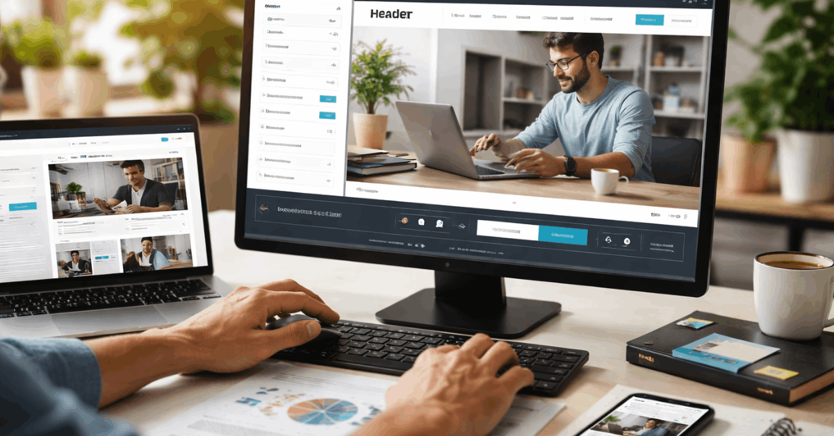
Reuse Sections and Shared Styles
Build sections around a purpose, such as an introduction, service list, proof area, or contact form. Reuse colors, buttons, and header content so visitors recognize familiar patterns.
Check that every section supports the page goal before duplicating it. A shorter homepage with useful details often works better than a long page full of repeated effects.
Keep Squarespace Changes Structured
Squarespace uses sections and blocks for organized editing. It offers a polished starting structure without free placement.
Work With Built-In Blocks First
Use sections for text, images, galleries, forms, and calls to action. Adjust fonts, colors, buttons, and spacing through native style controls before looking for a workaround.
Squarespace’s Fluid Engine allows block placement and resizing within its layout system. Respecting grid guidance helps retain alignment across desktop and mobile screens.
Add CSS Only When Needed
Custom CSS can refine a detail that built-in settings cannot change. Use it for a documented need, such as a small spacing fix or shared button treatment.
Too much custom code can complicate later edits and cause mobile issues. Test each change separately, then save a copy with a note explaining its purpose.
Build Reusable Webflow Styles
Webflow gives detailed control but needs careful naming and reuse. A clean class system prevents inconsistent pages.
Name Classes by Their Purpose
Name classes for their role, not their position on one page. A shared button, card, or section heading should use one consistent style.
Webflow’s Style panel helps manage selectors, classes, and combo classes across the site. This reusable approach makes global revisions easier and reduces visual drift as pages grow.
Use Components for Site-Wide Areas
Build headers, footers, and repeated calls to action as reusable components. Editing one component can update its shared instances and reduce mismatched details.
Confirm that the shared content belongs on every page before making it global. A page-specific message should stay local, even when the surrounding layout repeats.
Review Mobile Layouts While Editing
A template can look polished yet fail on a phone. Check mobile behavior throughout customization.
Test Real Content at Smaller Widths
Long headlines, real photos, and full form labels can create different spacing than demo content. Preview each page at smaller widths and look for overlaps, awkward breaks, hidden elements, or tiny buttons.
Webflow’s responsive-design lessons show how breakpoints help layouts adjust across screen sizes. Use that mobile review to fix the visitor path before adding decorative effects.
Simplify Instead of Shrinking Everything
Mobile design is not desktop design made smaller. Stack related content, shorten menus, remove nonessential effects, and keep the main action reachable.
This improves readability without forcing visitors to zoom or scroll through crowded sections. Test on a real phone because an editor preview cannot show every browser or touch behavior.
Keep Navigation and SEO Practical
Customization affects more than style. It should improve findability and clarity.
Before publishing, check these site essentials:
- Menu: key pages are easy to find.
- Headings: each page has a clear topic.
- Images: alt text describes useful content.
- Forms: messages reach the correct inbox.
Simplify the Main Menu
A menu should show pages visitors need first, not every internal idea. Group related pages carefully and use clear labels instead of clever names.
This supports easy navigation on desktop and mobile. Visitors should reach services, products, or contact details without opening several nested menus.
Preserve Headings and Page Details
A redesigned section can turn a clear heading into decorative text. Keep one accurate H1, use logical lower headings, and write page titles that describe the content.
This keeps content structure useful after visual changes. Review image descriptions, links, and metadata whenever you replace template content or move important details.
Test Changes Before Publishing
Templates speed editing, but publishing can expose unfinished details. Use previews and duplicates to keep major edits recoverable.
Check the Full Visitor Route
Open the site as a new visitor and complete the main task. Read the key page, use the menu, submit a form, and check confirmation messages.
Ask another person to repeat the process without instructions. Their first reaction often reveals unclear labels, missing details, or steps that felt obvious only to you.
Keep a Record of Bigger Edits
Duplicate a page or use version tools before restructuring important sections. Record custom code, embedded services, and global components affecting several pages.
This creates a recovery path when an experiment changes more than expected. It also makes handoffs easier when another editor maintains the customized template.
Conclusion: Keep the First Version Clear
A customized template should make your content easier to use. Start with the real message, then adjust structure, styles, and mobile behavior.
Keep reusable elements organized and remove choices that do not support visitors. A clear site is more valuable than a decorated template that is hard to update as the site grows and changes later.