
A website template gives you a working structure before you add your own content, colors, images, and calls to action.
The risk comes when small edits slowly damage the layout, spacing, or mobile behavior that made the template useful in the first place.
This guide is for site owners, content teams, and digital project managers who need to customize templates without turning a clean design into something uneven. You will learn what to change, what to leave alone, and how to test edits before publishing.
Understand What the Template Is Protecting
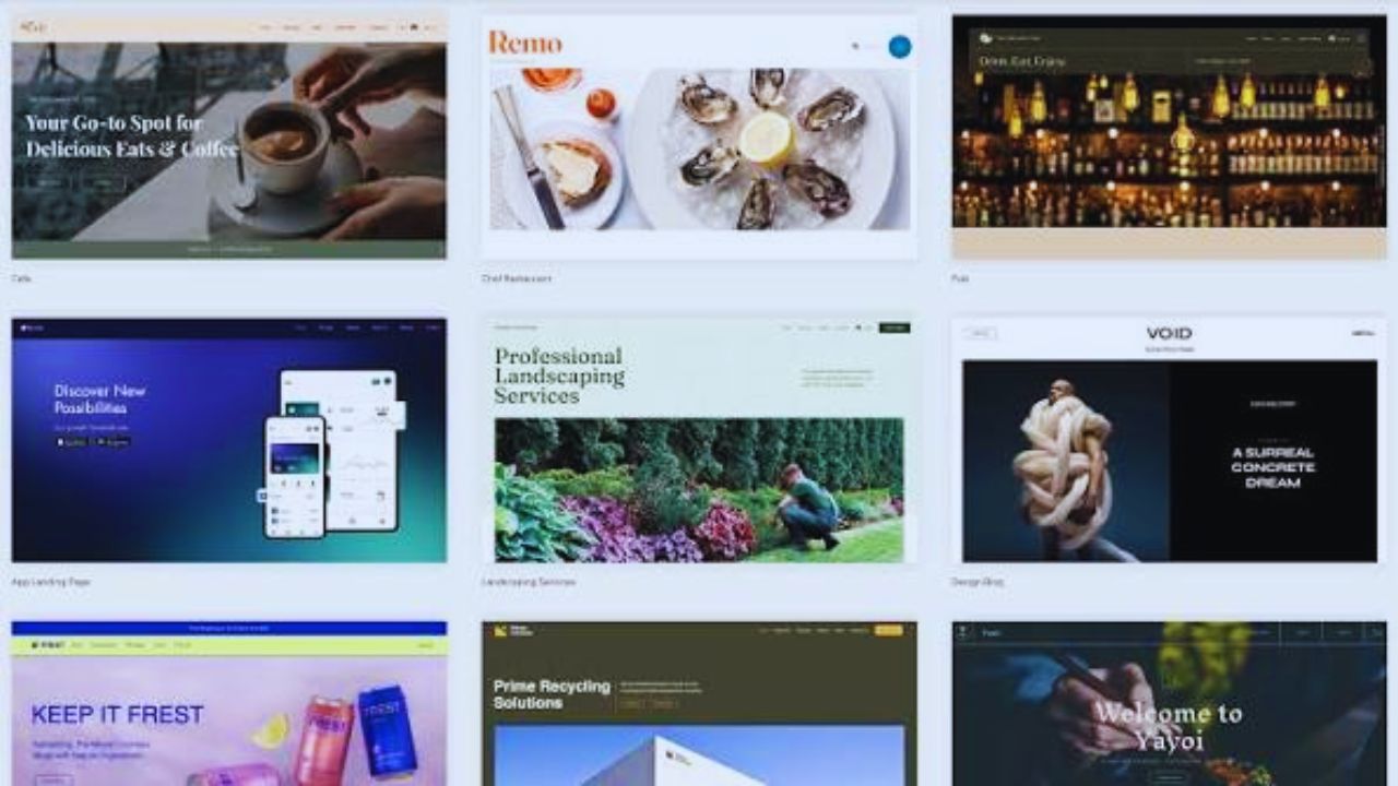
A template is not only a visual shortcut. It holds the page rhythm, grid, responsive rules, spacing, and reusable sections that keep the site easy to scan.

Structure Should Come Before Style
Before changing anything, look at how the template organizes content. A service-page template may place the headline, benefit section, proof block, and contact form in a deliberate order.
If you remove that structure too quickly, the page may lose its visual balance even if the new colors look better. Good customization respects the original framework while making the design feel specific to your brand.
Know When Customization Is Worth Doing
Not every template needs heavy editing. Sometimes the best improvement is replacing generic text and images while leaving the structure almost untouched.
Change What Helps the Content Fit
Customization makes sense when the template does not match your actual content. A pricing section may need fewer columns, a feature grid may need longer descriptions, or a landing page may need a stronger signup block.
If you use Elementor templates, for example, you can often adjust sections visually without rebuilding the entire page. The goal is to make the content clearer, not to redesign for its own sake.
Set Boundaries Before You Edit
Many broken designs start with edits that seemed harmless. A changed width, deleted container, or oversized image can affect the whole layout.
Decide What Is Safe to Touch
Fonts, colors, images, icons, button labels, and copy are usually safer to edit than grids, breakpoints, and core containers.
If you are unsure, duplicate the section first and work on the copy. Avoid changing fixed widths, custom CSS, or responsive settings unless you know how to test the result. Clear editing limits protect the mobile layout and reduce cleanup work later.
Keep the Grid and Spacing Intact
The grid is what keeps a template looking organized. It controls how text, images, buttons, and cards sit together across different screen sizes.
Restyle Sections Instead of Rebuilding Them
If a testimonial block does not fit your brand, change the background, quote style, image, or button instead of deleting the whole container.
If a feature-card section feels too generic, rewrite the labels and swap icons while keeping the column structure.
This is safer than building a new section from scratch because the spacing and responsive behavior are already tested. Small edits can create a cleaner design without weakening the structure.
Be Careful With Fonts, Colors, and Buttons
Style changes are often the easiest to make, but they can quickly become messy. A template that uses too many fonts, bright colors, or button styles can feel less trustworthy.
Keep Visual Choices Consistent
Use one main font for body text and one for headings, unless the template already has a stronger system. Keep buttons consistent in shape, size, and spacing so visitors know what is clickable.
If you use a builder like Wix, avoid changing every section separately when global style settings can keep the design unified. Consistency makes the page feel more polished than random decoration.
Replace Images Without Damaging Layout
Images can make a template feel personal, but they can also break the design if sizes and proportions are ignored. This happens often when demo images are replaced with files that are too tall, too wide, or too heavy.
Match Image Shape and Purpose
Check the original image ratio before uploading replacements. A wide hero banner should not be replaced with a vertical phone photo unless the template supports cropping.
Product cards, team photos, and blog thumbnails should stay visually consistent so the page does not look patched together. Compressing images also protects page speed, especially when visitors use mobile data.
Also Read: No-Code Tools for Landing Pages
Add New Sections Only When Needed
Adding sections can improve a template, but only when the new content has a clear purpose. Extra blocks often create clutter instead of value.
Clone Existing Blocks First
If you need a new FAQ, tool list, feature area, or tutorial block, start by cloning a section that already fits the page style.
This keeps margins, heading sizes, and column widths consistent. In Webflow, reusable components can help keep repeated sections controlled across several pages. New sections should support the page flow, not interrupt it with a different visual style.
Use this quick check before adding a section:
- Does it help users?
- Does it match spacing?
- Does it work mobile?
- Is it necessary?
Check Mobile Before Publishing
A template can look perfect on desktop while failing on a phone. Mobile issues usually appear in menus, buttons, image cropping, forms, and long text blocks.
Test Real Mobile Behavior
Preview modes are useful, but also open the page on a real phone before publishing. Tap the menu, submit a form, scroll through sections, and check whether buttons are easy to reach.
Avoid hover-only effects because they do not translate well to touch screens. Mobile testing protects the user experience where small layout mistakes become obvious quickly.
Keep a Rollback Plan
Customizing safely also means knowing how to undo changes. Without a rollback option, one broken edit can create unnecessary stress.
Save Versions as You Work
Duplicate the template, save previous versions, or use platform history before making larger edits. If you are editing code, use version control or at least keep a dated copy of the original files.
This is especially useful when several people are editing the same template. A rollback plan gives your team editing confidence without encouraging careless changes.
Conclusion: Customize With Restraint
A template works best when you improve it without fighting its structure. Keep the grid, spacing, and mobile behavior stable while changing the parts that make the site feel specific: copy, images, colors, buttons, and useful sections.
Before publishing, test on desktop and mobile, compress visuals, check forms, and save a rollback version.
Careful edits help your website template feel custom while keeping the design reliable. For busy teams, this balance saves time because future edits stay easier to review, explain, and repair when something needs to change over time safely.