A responsive website template should do more than make a site look clean and modern. It should help your pages work properly on phones, tablets, laptops, and larger screens without forcing visitors to pinch, zoom, or hunt for basic information.
This matters for bloggers, small shops, freelancers, clinics, restaurants, and local service businesses that rely on quick actions like calls, bookings, purchases, or inquiries.
This guide explains what to check before choosing a responsive template, so you avoid a design that looks good in a demo but creates problems after launch.

Why Responsive Design Matters After Launch
A template may look impressive on a desktop preview, but most real visitors will not view your site in perfect demo conditions.
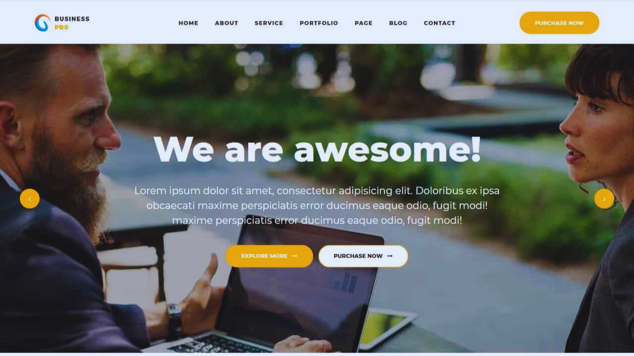
They may open it from a phone while comparing services, checking store hours, reading a blog post, or trying to complete a purchase.
Mobile Visitors Need a Smooth Path
A good responsive design adjusts menus, images, buttons, forms, and text so the page feels natural on smaller screens.
For example, a dental clinic’s “Book an Appointment” button should stay easy to tap, not shrink beside a crowded header.
A restaurant menu should load clearly without forcing users to zoom just to read prices or opening hours. If the layout makes simple actions difficult, the design becomes a real usability problem, not just a visual issue.
What to Check Before Choosing a Template
Choosing a template should start with how the site will be used, not only how the homepage looks.
A portfolio, online store, blog, coaching site, and local business website all need different layouts, page types, and editing options.
Test the Demo Like a Real Visitor
Open the template demo on your phone, tablet, and desktop before deciding. Click the menu, test buttons, scroll through long pages, check image sizes, and see whether forms are comfortable to fill out.
For an online store, look closely at product pages, cart pages, filters, and checkout steps. For a service business, check whether phone numbers, quote forms, location pages, and contact buttons remain visible and easy to use on mobile screens.
Speed Should Be Part of the Decision
A template can be responsive and still feel slow. Heavy design effects, oversized images, sliders, animation scripts, and unused features can make a mobile page drag even when the layout technically adapts.
Avoid Designs That Load Too Much
A photography template with full-screen galleries may look beautiful, but it can slow down badly if every portfolio page loads large images without control.
A restaurant site may not need video backgrounds when visitors mainly want the menu, map, hours, and reservation button.
A blog does not need several animation effects if they distract from reading. A lighter website template often gives visitors a better experience because it loads the essentials first.
Customization Should Match Your Skills
A strong template gives you room to adjust the site without making every edit feel risky. This matters after launch, when you need to change banners, update text, add pages, or adjust sections based on real feedback.
Editing Should Not Require Constant Code Work
If you are a solo creator, a small business owner, or a small team, check whether the template has clear controls for fonts, colors, spacing, headers, footers, and page sections.
A bakery might need to update seasonal product photos every month. A consultant may want to change service descriptions after testing which offers get more inquiries.
If each small edit requires custom code, the template may create long-term friction even if it looks polished at first.
SEO Basics Should Be Built Into the Structure
A responsive site still needs a clear structure that search engines and visitors can understand. The template should support readable headings, clean page layouts, metadata fields, image alt text, and simple navigation.
Good Structure Helps Content Work Better
For a blog, article pages should make titles, author details, categories, images, and related posts easy to manage.
For a local plumbing company, service pages like “Water Heater Repair,” “Drain Cleaning,” and “Emergency Plumbing” should have enough space for useful text, contact details, and service-area information.
If the template buries important content under sliders or decorative blocks, it may weaken both user experience and search visibility. The design should support the content, not compete with it.
Support and Updates Are Not Small Details
Many people choose templates based on screenshots, then discover later that the developer no longer updates the theme. That can create issues when browsers, plugins, builders, or content systems change.
Check Whether the Template Is Still Maintained
Before using a template, review its update history, support comments, documentation, and compatibility notes.
For WordPress users, this is especially important when a theme depends on plugins, page builders, forms, or e-commerce tools.
An outdated real estate template, for example, may conflict with listing plugins or map features after a platform update. A maintained template with clear support can reduce repair stress when something breaks.
Accessibility Should Not Be Ignored
A responsive template should be usable for more than one type of visitor. Some people browse with screen readers, keyboard navigation, zoom settings, or high-contrast display needs.
Check Simple Accessibility Signals
You do not need to be an accessibility expert to notice basic problems. Look for readable font sizes, clear button labels, strong color contrast, visible focus states, and menus that can be used without confusion.
A job board template, for example, should not hide application buttons behind tiny icons or low-contrast text. These details make the site more usable and help avoid a frustrating experience for visitors who already know what they want to do.
Also Read: Best Website Templates for Mobile-First Design: Responsive, Fast, and User-Friendly Options
Licensing Can Affect Future Use
A template license can shape what you are allowed to do with the design. Some licenses allow one website only, while others restrict commercial use, client projects, updates, or template redistribution.
Read the Terms Before Building
Check whether the template can be used for business purposes, multiple sites, client work, or future redesigns.
If you run an agency, a one-site license may not fit client projects. If you plan to sell products, make sure the license allows commercial use. It is better to confirm these details early than rebuild later because the template’s license terms were too limited.
A Short Pre-Launch Template Check
Before committing, it helps to do a quick review based on the site you actually plan to build. Keep the list short and practical, because the goal is to catch problems before they become expensive.
- Test the demo on phone and desktop.
- Check page speed and image behavior.
- Review support, updates, and license terms.
- Confirm that key pages fit your content.
Conclusion: Pick the Template That Makes Daily Use Easier
A responsive website template should be judged by how it works after the first week, not just by how attractive the demo looks. Test the design on real devices, check whether important actions are easy, and make sure the layout fits your content type.
A good choice may not be the flashiest option, but it should be fast, flexible, readable, updated, and realistic for your skill level.
Before building the full site, spend time checking mobile behavior, support history, SEO structure, accessibility, and licensing so the template supports your work instead of adding avoidable problems.