A mobile-first website template is built around phone visitors before desktop users. That matters because people often check websites while commuting, comparing services, booking appointments, shopping, or reading from a small screen.
If the layout feels crowded, slow, or hard to tap, visitors may leave before they reach the most important information.
This guide explains how mobile-first templates work, who they suit, and what to check before choosing one.
Why Mobile-First Design Matters Beyond Appearance
Mobile-first design is not just about making a website look smaller on a phone. It changes how menus, buttons, images, forms, and content behave when space is limited.
Small Screens Need a Clear Path
A strong mobile layout helps visitors take action without guessing where to go next.
For example, a dental clinic should keep its booking button easy to tap, while a restaurant should make its menu, location, opening hours, and reservation option easy to find.
A plumbing company should not hide its emergency number behind three menu taps. These details affect real inquiries, not just design quality.
How Mobile-First Templates Support SEO
Search performance depends on content, site structure, speed, and usability. A weak mobile experience can make even useful pages harder for visitors to read and trust.
Clean Structure Helps Pages Perform
A good mobile-first template supports readable headings, simple navigation, fast loading, and clean content blocks.
It will not replace helpful content, but it can prevent problems like tiny text, crowded buttons, slow images, or confusing menus.
For a local service page, visitors should quickly see the service, location, contact details, and next step. For a blog, readers should move through the article without fighting the page layout.
What Makes a Template Truly Mobile-First
Some templates are only responsive, meaning they shrink a desktop layout to fit a smaller device. A true mobile-first design starts with the phone experience, then expands for tablets and desktops.
Practical Features Matter Most
The most useful features are often simple. Look for large tap targets, readable fonts, lightweight pages, clear menus, and sections that stack naturally.
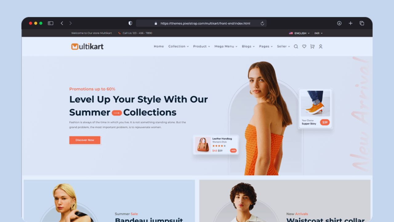
A clothing store template should make product photos, size options, and checkout buttons easy to use with one thumb.
A coaching website should keep testimonials, pricing, and booking links readable without awkward endless scrolling.
Use this short check before choosing:
- Large buttons
- Readable text
- Fast loading
- Simple menus
Choose Based on the Type of Website
A mobile-first template should match the site you are building. A design that works for a photographer may not suit an online store, job board, clinic, restaurant, or long-form blog.
Also Read: Top Website Templates for Business: Boost Your Brand with Ready-Made Designs
Match Layouts to Real Tasks
For an online store, test product pages, filters, cart behavior, and checkout steps. For a restaurant, check whether the menu, map, opening hours, and booking button are easy to reach.
For a real estate website, property photos, map views, listing filters, and lead forms should not feel cramped. For a blog, article pages should keep titles, images, categories, author details, and related posts clean and readable.
Speed Should Be Tested Early
A template can look modern and still load slowly. Mobile visitors may be using weak Wi-Fi or mobile data, so heavy design choices become more noticeable on phones than on desktops.
Avoid Heavy Design Extras
Be careful with templates that depend on video backgrounds, large sliders, animation effects, or too many add-ons.
A gym website may look energetic with moving banners, but visitors mainly need class schedules, pricing, location, and sign-up details.
A bakery does not need a heavy homepage if customers want today’s menu, custom cake options, and contact information. A lighter website template usually creates fewer speed problems later.
Customization Should Be Easy to Manage
A template should not trap the owner after launch. Regular updates should feel manageable, especially for small teams without a full-time developer.
Editors Need Practical Control
Check whether you can adjust fonts, colors, sections, headers, footers, and buttons from clear settings. A clinic may need to update holiday hours, while a restaurant may change menu prices every season.
A freelancer may replace portfolio samples after finishing new projects. If each edit needs code, the template can create ongoing maintenance work even if it looked convenient at first.
Mobile Navigation Needs Careful Review
Navigation is where many mobile layouts become frustrating. A desktop menu may look organized, then turn confusing once it becomes a hamburger menu on a phone.
Key Actions Should Stay Visible
For a service business, the phone number, quote button, and main service pages should be easy to reach. For an online course site, visitors should quickly find course details, pricing, instructor information, and enrollment steps.
Avoid templates that hide important pages under vague labels like “More” or “Explore.” Mobile navigation should feel direct and simple because visitors often arrive with a specific task.
Accessibility Should Not Be Treated as Optional
A mobile-first template should work for different visitors, including people using screen readers, zoom settings, keyboard navigation, or high-contrast displays. These details make the site easier for more people to use.
Basic Checks Can Prevent Friction
Look for strong color contrast, clear button labels, readable font sizes, and forms that are easy to complete. A job application site should not use pale gray text for required fields or tiny upload buttons for resumes.
A medical clinic site should make phone numbers and appointment forms easy to identify. These choices support real usability, not just technical compliance.
Platform Choice Affects Long-Term Work
Wix, Squarespace, Webflow, WordPress, and template marketplaces can all offer mobile-friendly options. The better choice depends on your budget, editing skills, and how much control you need.
Support Matters After Launch
Before choosing a platform or template, review update history, documentation, support comments, and editing limits.
A WordPress theme may offer more flexibility but require more care with plugins and updates. Squarespace or Wix may feel easier for beginners but less flexible for advanced layouts. Webflow can be powerful for designers, but it may feel less simple for quick content updates.
Common Mistakes That Weaken Mobile Pages
Even a good mobile-first template can become difficult if it is customized without care. Most issues come from adding too much, skipping real-device tests, or ignoring what visitors came to do.
Keep the Mobile Version Focused
Avoid pop-ups that cover the screen, oversized image files, hover-only effects, and long menus with too many choices.
A donation page should not force visitors to close two pop-ups before seeing the donation form.
A hotel website should not make users scroll past huge image blocks before reaching room prices or booking details. The mobile experience should stay focused on the visitor’s main action.
What to Review Before Publishing
Before launch, test the template like a visitor, not like the site owner. Use a real phone, try mobile data, and complete the main task yourself.
Final Checks Before Going Live
Try booking an appointment, submitting a form, reading a full article, adding a product to cart, or opening the map from a phone.
Check whether text is readable outdoors, buttons are easy to tap, and pages do not jump while loading. Also review license terms, update access, and support availability before building too much around one design. These checks can prevent avoidable fixes after launch.
Conclusion: Choose for the First Tap
A mobile-first website template should make the site easier to use where many visitors begin: on a phone. The right choice depends on your content, audience, platform, and editing needs, not only the homepage design.
Before committing, test real pages, check speed, review navigation, confirm support, and make sure the template fits your daily workflow.
A good template will not solve every website problem, but it can give you a cleaner foundation for a site that feels usable from the first tap.