Minimalist website templates work best when they make a site feel clear, not empty. A clean layout can help visitors focus on your content, your offer, and the next step without fighting through clutter.
This style can be useful for bloggers, freelancers, small businesses, portfolios, landing pages, and simple online stores.
This guide explains what to check before choosing a minimalist template, where this design style fits, and which mistakes can make a “simple” website feel unfinished.
What Makes a Minimalist Template Work
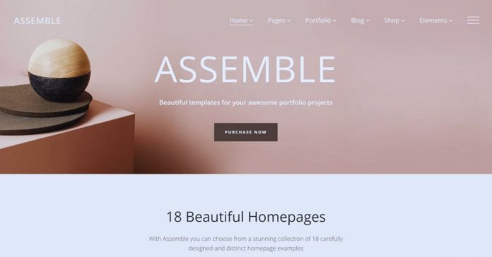
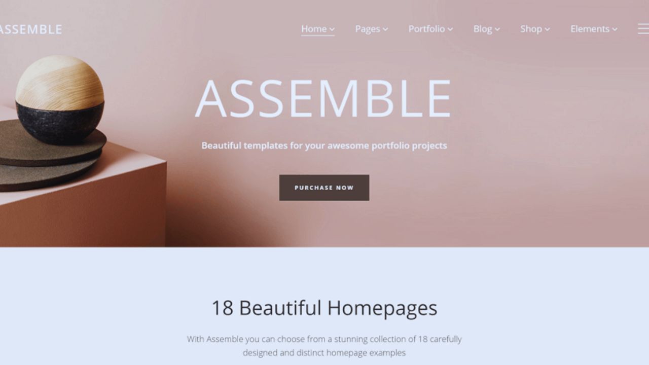
A minimalist template is not just a design with fewer images or smaller menus. The better versions use space, structure, and typography to guide visitors through the page.
Every section should have a reason to be there, whether it introduces a service, shows work samples, explains pricing, or leads someone to contact you.
If the template removes too much, the site may look elegant but fail to answer basic visitor questions.
When a Minimalist Website Makes Sense
Minimalist websites are especially useful when the message is simple and focused. A photographer may want large images and very little text.
A consultant may need a clear service page, a short bio, testimonials, and a contact form. A blogger may want readable article pages without crowded sidebars.
This style can also work for product landing pages, as long as the template still gives enough room for features, pricing, proof, and support details.
When Minimalism Can Feel Too Limited
Minimalism is not always the right fit. If your website needs many categories, advanced search, complex product filters, or large resource libraries, a very stripped-down template can frustrate visitors.
A school, marketplace, news site, or large e-commerce store may need more navigation than a minimalist design usually provides.
In those cases, a cleaner traditional layout may work better than forcing everything into a sparse design.
Features That Matter More Than Decoration
The most useful minimalist templates are quiet on the surface but practical underneath.
Before choosing one, check whether it supports mobile layouts, fast loading, readable fonts, clear buttons, SEO settings, and flexible sections.
A template can look beautiful in a demo but become difficult once you add real service descriptions, product photos, or longer blog posts. The goal is not only to remove clutter, but to keep the site usable.
A Short Checklist Before Choosing
Use this quick check before installing or buying a template. It helps you avoid designs that look clean but are hard to manage later.
- Readable text on desktop and mobile
- Clear navigation without hidden important pages
- Fast loading with real images added
- Flexible sections for future content
Website Builders That Suit Minimalist Designs
Many website builders offer minimalist templates, but they serve different needs.
Squarespace is known for visual polish, making it useful for portfolios, creators, restaurants, and service brands that rely on strong imagery. Wix gives more drag-and-drop flexibility for beginners who want to adjust layouts quickly.
Webflow offers more control for designers and agencies, while WordPress gives broader theme choices and plugin options for blogs or business sites.
Also Read: Website Builders for Fast Site Creation
Minimalist Templates for Online Stores
For online stores, minimalism should never hide product details. A good store template keeps product photos, prices, size options, shipping notes, reviews, and checkout buttons easy to find.
Shopify and WooCommerce themes can work well here if the layout keeps buying steps simple.
Be careful with templates that look stylish but make filters, carts, or product descriptions feel secondary, because shoppers often need details before they trust the purchase.
Minimalist Templates for Portfolios and Freelancers
Portfolio websites often benefit from minimalist layouts because the work needs room to stand out.
A designer, photographer, writer, or architect should look for project pages that show samples clearly and leave space for short explanations.
The template should also make contact easy, since visitors may be ready to inquire after viewing only a few examples.
Avoid gallery-heavy templates that look impressive but load slowly or make project details hard to read.
Minimalist Templates for Blogs and Content Sites
A minimalist blog should feel calm, but not bare. Strong article pages need clean typography, category navigation, search, author details, and related posts when useful.
For a personal blog, a simple layout may be enough, but a tech, finance, food, or travel site may need more structure.
Before choosing, preview how the template looks after many posts are published, not just with three polished demo articles.
Minimalist Templates for Small Business Sites
Small business websites need more than a clean homepage. A useful template should make services, location, contact details, opening hours, testimonials, and FAQs easy to find.
A café may need menus and map directions, while a cleaning company may need service areas and booking forms.
Minimalism works here when it removes distractions, not when it hides practical information that customers need before calling or booking.
What to Check in the Demo Version
Demo pages can be misleading because they use polished photos, short text, and carefully chosen examples.
Test the template with real content in mind. Imagine your actual logo, longer headings, ordinary photos, service descriptions, and contact details inside the layout.
If the design only works with perfect images and very little copy, it may become awkward once your real website content is added.
Speed, SEO, and Mobile Usability
Minimalist templates often load faster, but this is not automatic. Large hero images, animations, sliders, and third-party widgets can still slow down a clean-looking site.
Check mobile performance, heading structure, image alt text options, metadata settings, and whether buttons are easy to tap. A minimalist design should make the site easier to use, not just easier to admire.
Customization Without Losing the Clean Look
A common mistake is starting with a minimalist template and then adding too many extras.
A popup, chatbot, slider, social feed, countdown timer, and several banners can quickly ruin the simple layout you chose in the first place.
Add features only when they serve a clear purpose, such as helping visitors book, subscribe, buy, or understand your offer. If something does not support that goal, it probably does not need to be on the page.
Free vs Premium Minimalist Templates
Free minimalist templates can work for personal sites, early drafts, or small projects with basic needs.
Premium templates may offer better support, more layout options, regular updates, and cleaner documentation.
For business websites, client work, or stores, support and updates can matter more than the design preview. Before paying, check the license, update history, reviews, and whether the template still works with your chosen platform.
Conclusion
A minimalist website template should make your site clearer, faster, and easier to understand, but it still needs enough structure to serve real visitors.
Before choosing one, check whether the design supports your content, your platform, your mobile users, and the action you want people to take. Do not choose a template only because the demo looks elegant.
Test it with your own text, images, services, products, or articles in mind. The best minimalist design is not the emptiest one; it is the one that removes distractions while keeping the information people need.