
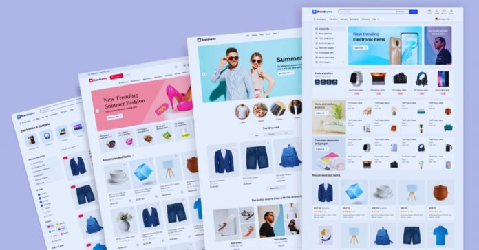
A store template should do more than make an online shop look finished. It must help real customers find products, understand practical details, and reach checkout without second-guessing what happens next.
This guide is for sellers choosing an e-commerce layout before spending time on colors, apps, or extras. It explains how to judge a template through the customer journey, not a polished demo alone.
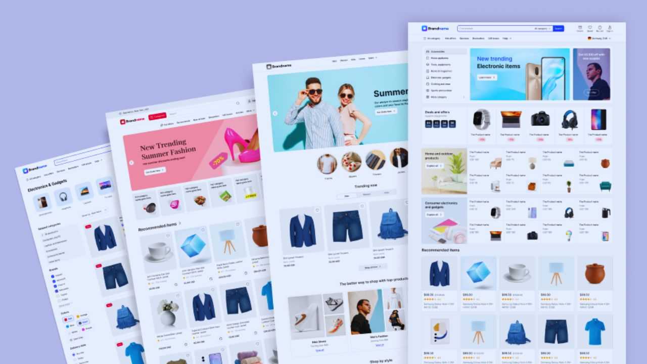
Begin With the Way People Browse Your Products
A template should follow the way a person compares, selects, and pays for your kind of product. Product behavior and customer questions should shape the layout before a visual style does.
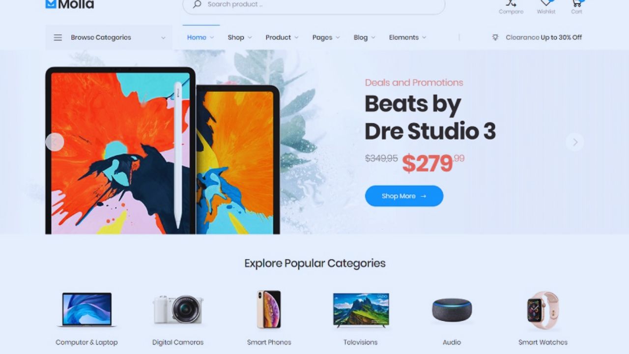
Match the Homepage to a Clear Shopping Need
A candle maker may need scent categories, burn times, and gift sets near the top, while a furniture seller may need dimensions, delivery zones, and room-based collections.
One trendy layout may not serve both. Look for a useful first screen that tells shoppers what you sell and where to go next.
Avoid a large hero image that hides the catalog when visitors arrive from an advert for a specific product.
Let Product Pages Do the Work of a Sales Assistant
Before choosing a theme, open its product-page demo on a phone and pretend to buy.
Check whether images enlarge, variants are simple to select, delivery information has a natural place, and the add-to-cart button remains visible.
Those details reduce purchase uncertainty and abandoned carts more than decorative animation. A handmade skincare store needs ingredients and allergy guidance within reach; a T-shirt shop needs sizing, fabric notes, and return terms as clearly.
Choose Navigation for Your Actual Catalog
A simple shop can feel cluttered when it copies the navigation of a large retailer. Catalog size and product complexity determine whether shoppers need filters, menus, or only a few clear paths.
Keep Small Collections Easy to Scan
If you sell ten stationery items, a featured collection and simple shop link may be enough.
Too many filters, banners, and category names can make a small catalog feel less trustworthy because the store seems to promise more choice than it has.
Give buyers a calm browsing path and plain collection labels they recognize. “Notebooks,” “Pens,” and “Gift Sets” work better than clever menu names that force people to stop and decode them.
Check Filters Before You Need Them
A clothing shop with many sizes, colors, and seasonal products needs filtering before it needs a dramatic homepage.
An electronics store may need buyers to compare specifications, compatibility, and warranty terms without opening every item.
Shopify’s theme marketplace lists free and premium themes, while individual pages identify tools such as product filtering and sorting. Focus on buyer priorities and comparable information, not a theme with an impressive banner.
Also Read: Website Templates for Long-Term Projects
Test the Template Like a Customer Would
Theme demos are designed to look smooth, but they cannot show whether your own products will fit. A real-world test and mobile checking reveal limitations before a launch creates avoidable work.
Use Your Own Product Details in a Trial Page
Add three real products with normal image sizes, titles, prices, and descriptions. A layout that looks spacious with professional demo photos may feel crowded when a title wraps across lines or an image has a different shape.
Check your content and your normal workload, not the seller’s ideal example. This reveals whether sale labels, delivery notices, and reviews appear in a sensible order rather than interrupting purchase decisions.
Test the Phone Checkout Route From Start to Finish
Shoppers will not view your store as you edit it on a laptop. Open it on a phone, find one product through search or a collection, choose a variation, add it to cart, and begin checkout.
Notice every hesitation: a tiny button, slow image, or late delivery charge. This protects mobile convenience and checkout confidence. Ask another person to try without guidance; they will notice problems an owner has learned to ignore.
Do Not Let Design Hide Missing Store Details
A strong template cannot answer questions you have not supplied. Accurate product information and visible policies are what make a clean store credible after an image.
Put Delivery, Returns, and Availability Where They Matter
Shoppers should not search a footer to learn whether an item ships internationally, is made to order, or can be returned.
Place relevant details near the product choice or cart, using language that matches your business.
This reduces surprise after payment and support messages. A bakery accepting local orders should show cut-off times and collection windows; a downloadable template seller should explain file access, formats, and refund limits before checkout.
Treat Images and Descriptions as Part of the Layout
A theme cannot rescue dark, inconsistent, or misleading product photographs. Use images that show scale, texture, color variation, and what buyers will receive, then write descriptions that answer the questions those images raise.
That creates better product expectations and fewer returns. Do not reuse one marketing sentence; explain material, care, use, or compatible accessories when those details affect a decision.
Customize the Store Without Breaking Its Clarity
Templates should give a brand a recognizable voice, but excessive editing can damage the parts that help people shop. Consistent branding and functional restraint are safer than changing every available block.
Change the Elements Customers Notice First
Start with your logo, color palette, type choices, photography, and language around delivery or support.
These changes make a familiar template specific without moving navigation or hiding key purchase information. Wix says its store templates are mobile-friendly and customizable with drag-and-drop tools, but test every change after making it.
Preserve predictable shopping patterns when you edit; customers expect cart, search, price, and checkout in familiar places.
Keep a Short Pre-Launch Check
Before publishing, review the store as someone who does not know your products or policies. Look for issues that damage trust immediately, rather than adding another app or homepage section. Use this short practical check and final customer view:
- Find: Can a first-time visitor reach a product category quickly?
- Decide: Are price, variations, delivery, and return details visible?
- Buy: Does the phone cart and checkout path work without confusion?
Conclusion: Use the Template to Support the Sale
The right e-commerce template matches how customers browse and what they need to confirm before payment.
Start with your own products, then test it on a phone before paying for extra design features.
Keep policies, availability, and product facts accurate as the store changes. A clean, familiar buying path usually does more for a new shop than an elaborate design that leaves people unsure what happens after they click.