A personal site gives your writing, projects, services, or contact details a home beyond a social-media feed. For writers, artists, job seekers, and consultants, website builders remove the technical barrier while leaving room for a recognizable online identity.
The useful choice is not the platform with the prettiest sample page; it is the one that lets you publish and update work without friction.
This guide covers the decisions that matter later, including editing, mobile layout, ownership, costs, and the limits that appear as your site grows, while also helping you avoid a rushed rebuild after early choices no longer fit.
Start With the Way You Intend to Publish
Templates cannot decide what your site should accomplish. Be clear about the visitor you expect and the action you want, such as reading an article, viewing work, or sending an inquiry.

That gives the site a useful purpose and prevents a crowded homepage. A personal site for recipes does not need the same structure as a consultant’s booking page.
Writers Need an Editor They Will Keep Opening
Someone publishing two articles each week needs a calm place to draft, organize, and update posts.
A writer comparing WordPress.com and Ghost should create a real post in each, add an image, change a heading, and check how older articles are grouped.
Look at categories, search, and scheduling instead of relying on a blank demo page. The strongest fit supports consistent publishing and a clear archive for returning readers.
Portfolio Sites Need the Work to Appear First
A photographer, illustrator, or freelancer needs visitors to understand their work within seconds.
Squarespace may be worth testing for a visual portfolio, while someone selling writing or consulting may prefer a simpler page for case studies and services.
Avoid effects that delay images, hide descriptions, or bury the contact route. Good portfolio pages provide quick context and make the next step clear.
Test the Daily Editing Experience Before Paying
A free trial is most useful when it resembles an ordinary workday rather than a design playground.
Replace sample text with your own material, create one page, and make edits after saving. This reveals whether the editing process feels natural or hides a frustrating workflow.
Use Real Content Instead of Placeholder Blocks
Build one ordinary blog post or project page with the text, photographs, captions, and links you would publish.
Add a heading, resize an image, save a draft, then return later to correct a sentence or replace a file.
Wix may feel approachable to a beginner, but every builder deserves the same test: can you make basic changes without breaking the layout? Choose one where routine updates stay manageable and simple fixes do not require outside help.
Preview More Than the Desktop Version
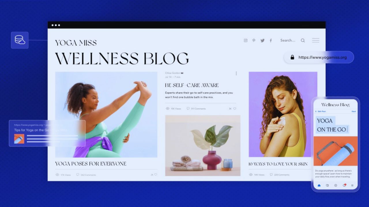
Many visitors will arrive from a phone after opening a profile link, message, or search result. Check the homepage, one article, and the contact page on a small screen, then tap every menu item and form button.
Watch for oversized banners, cropped images, long lines, or pop-ups that cover text. A thoughtful mobile check protects the first impression that a desktop preview can hide.
Compare the Costs and Limits That Arrive Later
Free plans are useful for learning an editor or testing a layout, but they may not suit an active blog or professional site.
A subdomain, visible branding, limited storage, or restricted forms may be acceptable first but less suitable once clients or employers visit.
Review the real costs and plan boundaries before the site becomes essential. Compare renewal prices, storage, and export rules before transferring your domain or publishing large media files.
Also Read: Website Templates That Simplify Design Work
Pay for Features You Will Actually Use
Read each plan with your next six months in mind. A food blogger may need image storage, a coach may need a custom domain and booking form, and a creator may need payment tools.
Check whether newsletters, analytics, support, and visitor limits cost extra. This keeps the monthly budget tied to practical needs, rather than untouched extras.
Keep Your Content and Domain Under Your Control
Before publishing, find out how to export posts, images, and contact lists, and confirm who owns the domain.
Save major articles and project images in a separate folder, especially if the site supports job applications or client work. Moving platforms can still take effort, but clear records prevent a stressful scramble. These habits protect content ownership and give you future flexibility.
Launch a Clear First Version, Then Keep It Current
A first website does not need ten pages, a complex brand kit, or every social link you have used.
It needs enough information for a new visitor to understand who you are, what you offer, and how to reach you. Start with useful essentials before adding extra features, because a smaller site is easier to improve.
Give Visitors the Information They Came For
For many people, a homepage, short about page, work or blog section, and reliable contact route are enough.
A student may show projects and experience, while a freelance translator might add service examples and a request form.
Write as though the visitor has never heard of you, using a direct opening rather than a vague welcome message. This creates reader confidence and makes the website feel deliberate before it has a large archive.
Before launch, check three practical details visitors notice quickly. Keep this short so it fixes visible gaps without becoming an endless project:
- Working contact route with a tested form or email address
- Readable phone layout for the homepage and one post
- Updated sample content with no leftover template text
Add New Features Only When They Solve a Real Need
A newsletter, calendar, store, members area, or chat widget can be useful, but every addition brings settings and maintenance.
Add one only when it supports a visitor task, such as booking a session or receiving articles. Too many widgets slow the page and distract from the work that brought visitors there. A restrained setup preserves site focus and leaves time for current content.
Conclusion: Pick a Builder You Can Still Use Next Year
The right choice is not necessarily the most elaborate site you can publish this weekend. It is the platform that matches your routine, works on visitor devices, and keeps your domain control and content exports within reach.
Test it with real material, price the features you expect to need, and leave room to change course without losing earlier work. A clear, current site with a reliable contact route usually serves you better than a larger one full of neglected pages.