A new website can stall at the point where you must decide what every section should look like. Website templates give you a practical starting frame for navigation, pages, spacing, and mobile layouts, so you can spend more time explaining your work.
They can suit a photographer, a local bakery, or a student portfolio. The real value comes when the layout supports your own message instead of making every site look like the same polished demo.
Begin With the Visitor’s First Task
A template is easier to judge when you know what a visitor needs to do first. That might be reading an article, viewing work, booking a service, or finding contact information.
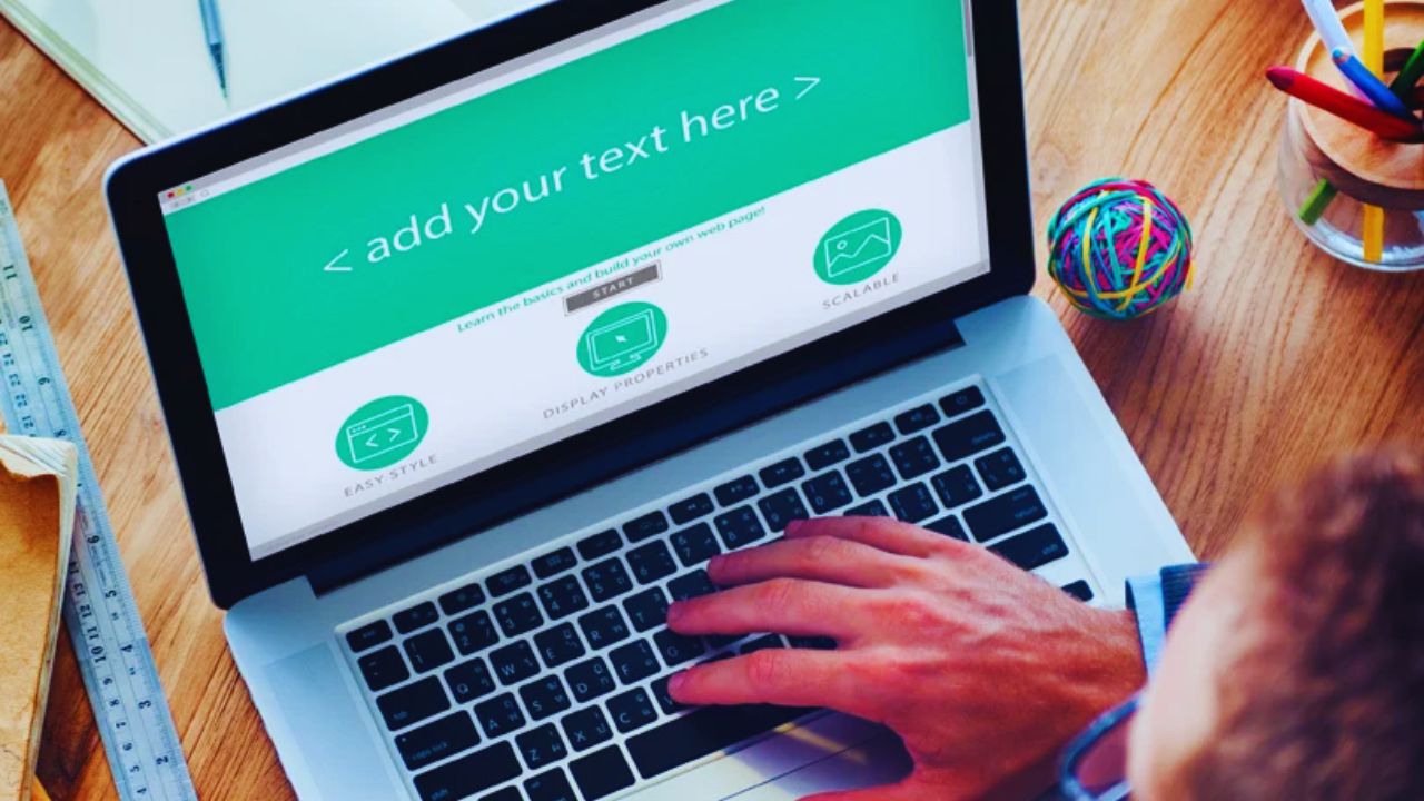
Starting there keeps the site purpose visible and prevents a crowded layout filled with sections that look attractive but do not help a real visitor.
Choose a Layout That Fits Your Content
A food blog needs readable recipe posts, categories, and generous space for images. A consultant may need service pages, case studies, and a simple enquiry form, while an illustrator needs a gallery that does not bury the work beneath decorative blocks.
Look past the homepage preview and open the article, portfolio, and contact layouts. A strong content structure already supports the pages you will publish.
Test It With Real Material, Not Demo Copy
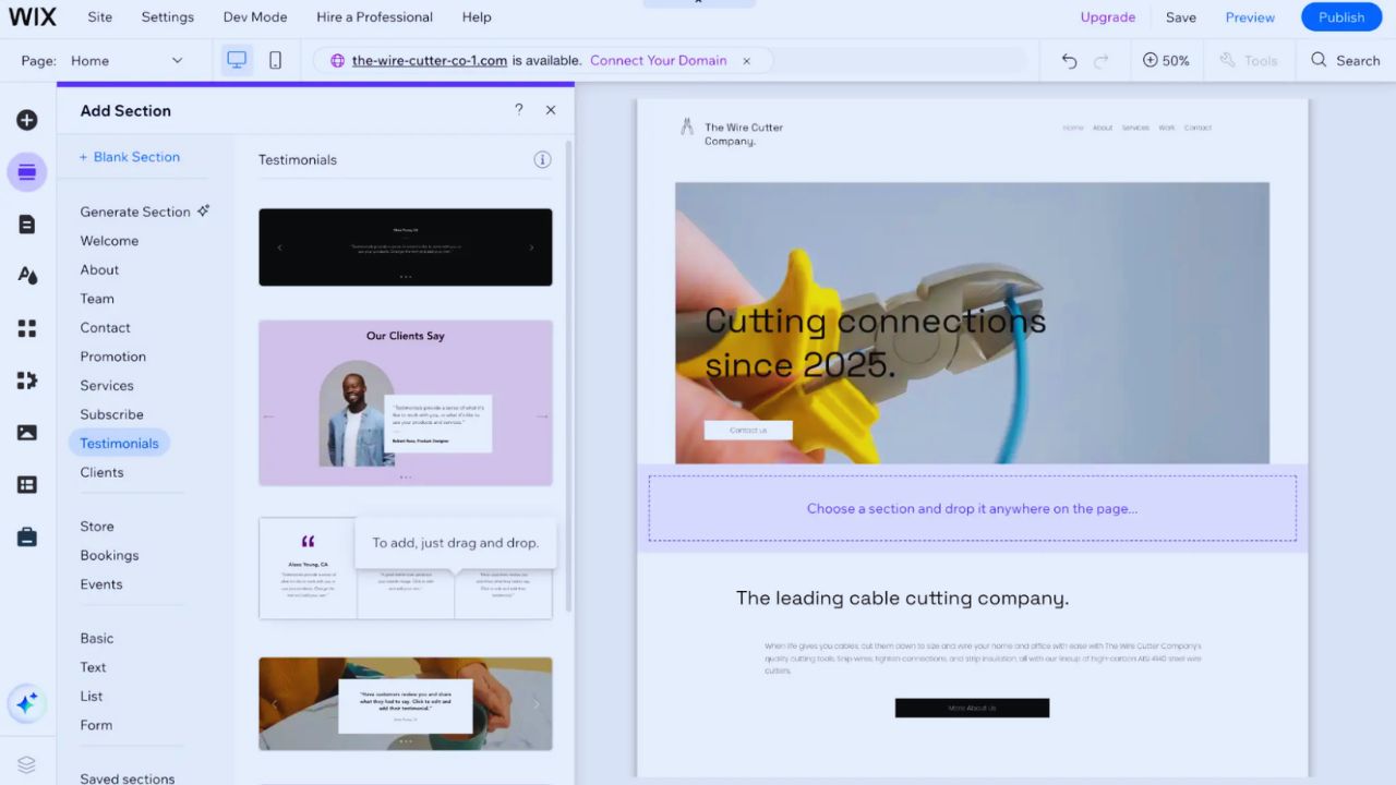
Replace the sample headline with one from your business or portfolio. Add an ordinary paragraph, a few real photographs, and a contact form before you decide the design is right.
This test exposes awkward line lengths, oversized images, or sections that suit only unusually short copy.
It also stops a common mistake: choosing dramatic placeholder photography, then finding the everyday content squeezed and hard to read.
Use the Design System Without Copying the Demo
Templates reduce repetitive layout work, but they should not erase the personality of the person or business using them.
Their grids, headings, and buttons create consistency; your wording, visuals, and priorities make the site recognisable. Think of the framework as useful structure, not a finished brand identity.
Change the Details Visitors Notice Repeatedly
Start with the few choices that appear throughout the site: your name or logo, main typeface, image style, heading tone, and action buttons.
A travel writer might use quiet destination photography and clear story categories, while a graphic designer may keep the palette restrained so the work carries the page.
Make those high-visibility changes first rather than changing every setting. Too many fonts, effects, and decorative icons create visual clutter, even when each looks good alone.
Keep Good Spacing and Navigation Intact
Most professionally prepared templates use spacing to separate ideas and guide a reader toward the next step.
Do not move or remove every block simply because the editor makes it possible. Keep the visual hierarchy unless a section hides useful information or creates a detour.
For example, placing a direct contact route below a large gallery may look clean, but it frustrates a visitor who wants to ask a question before scrolling through the page.
Check the Parts That Affect Daily Maintenance
The best-looking layout can become annoying if publishing a post, updating a menu, or replacing an image takes too many steps.
Before paying or committing, inspect the tools behind the screen. You are choosing the editing experience as much as the finished design.
Preview the Mobile Version Carefully
Open the homepage, a post, and the contact page on a phone. Tap the menu, submit a test form, and see whether images crop sensibly after you replace the sample files.
A restaurant needs its opening hours and menu link easy to find; a service business needs a usable call or enquiry button; a writer needs paragraphs that remain comfortable to read.
Check the tap targets, text size, and page flow yourself instead of assuming a responsive label guarantees a polished mobile experience.
Read the License, Support, and Update Terms
Free and paid options can both work, but their rules may differ around support, commercial use, updates, and stock assets.
Find out whether you can use it for a client, how many sites the licence covers, and whether demo images must go.
It is also worth checking how updates arrive if a plugin or platform changes. These details protect project ownership and prevent a surprise restriction once the site is already live.
Make the Finished Site Feel Like It Belongs to You
A template only looks generic when the demo content stays in place or every new feature is added without a reason.
Visitors notice placeholder testimonials, vague claims, duplicated stock images, and menus that lead nowhere. The aim is not to disguise the starting layout; it is to give the site specific information and a credible voice.
Replace Every Default Detail Before Publishing
Remove sample testimonials, imaginary statistics, filler blog posts, unused pages, and generic service descriptions.
Add useful information that a visitor can check: the area you serve, your current availability, the subjects you cover, or the type of work you accept.
A florist could show seasonal arrangements, while an editor could explain which manuscripts they review. Specific language creates reader confidence and replaces the copy-and-paste feel left by weak template content.
Before launch, make one check for the details visitors notice first. It keeps the first version tidy without turning publishing into an endless project, supporting a professional impression and clearer visitor path:
- Remove unused pages and demo text.
- Test the contact form on a phone.
- Confirm image rights and credits.
Add Features Only When They Solve a Visitor Need
A newsletter box, booking calendar, shop, chat tool, or member area can be useful, but not every site needs all of them.
Also Read: Website Builders vs Custom Sites: Key Differences
Add a feature because it helps someone complete a task, not because it appeared in the template preview.
An author may need an email signup for new releases, whereas a local tradesperson may benefit more from a prominent request form. A smaller group of well-maintained tools is usually more helpful than a page full of competing widgets.
Conclusion: Use the Framework, Keep Your Voice
A good template shortens the design stage because it provides an organised route for ordinary pages and visitor actions.
Test the layout with your real content, protect the mobile experience, and replace every default element that does not belong to your project.
Keep the design choices focused, check the licence before publishing, and leave room for the site to grow without adding clutter. The result should be easier to maintain, easier to understand, and recognisably yours without constantly redesigning basic website pages later.