

A freelancer picks a gorgeous template on Squarespace. Three months later, every page edit takes 20 minutes because the layout fights back.
That frustration is predictable. The template shaped the editing experience, the navigation logic, and the mobile behavior from day one.
Choosing templates in website builders feels like a design decision. It is a structural one. And the difference matters more than the color palette ever will.
This guide is for the person building their first real site: a portfolio, a service page, or a small blog. Someone who needs to get it right without rebuilding later.
Why the “Pick the Closest Match” Advice Gets It Wrong
Every template guide on the internet says the same thing: browse the gallery, find the design closest to your finished vision, and start customizing. That sounds logical.
But I think that advice leads to the worst template decisions on platforms like Wix and Squarespace, because “closest match” templates tend to be the most bloated.
Demo Templates Are Staging Tricks
A template demo looks polished because the designer filled it with perfect stock photos, curated placeholder text, and 12 to 15 pre-built sections stacked in a deliberate order. The moment real content replaces those placeholders, the illusion breaks.
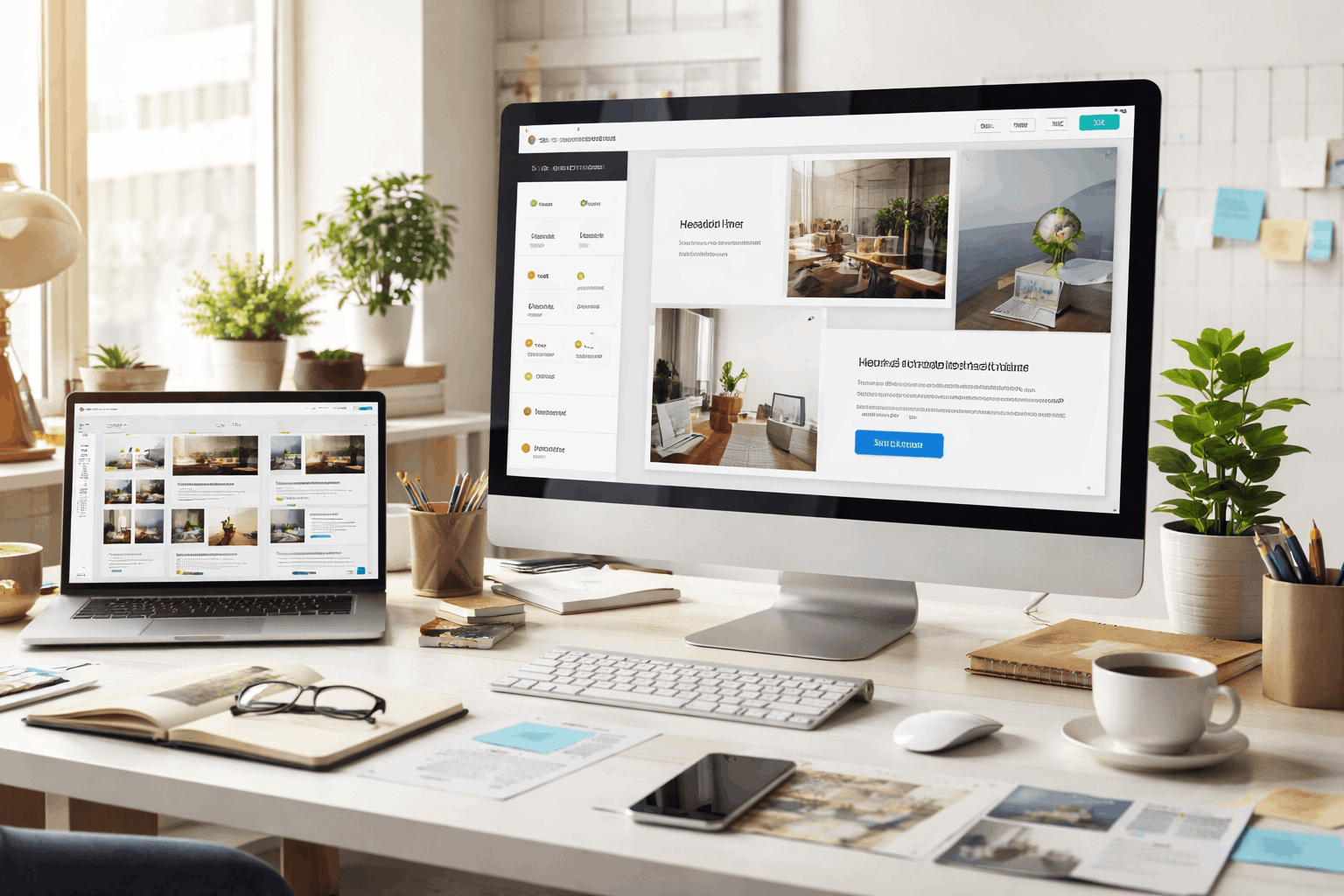
Headings that looked elegant at 4 words wrap awkwardly at 12. Hero images cropped for a specific aspect ratio distort when swapped. Sections that seemed airy turn cramped once the text says something real.
Start Simple, Build Up
The smarter approach: pick the cleanest template with the fewest pre-built sections and add what the site needs. A minimal starting point means less deleting, less debugging layout quirks, and more control over how the final site behaves on phones.
Think of it like renting an apartment. A place with built-in furniture looks great on the listing. But if that furniture doesn’t fit your life, you’re stuck working around someone else’s taste instead of building around your own.
A blank-ish template on platforms like Squarespace gives the builder full control over section order, content blocks, and spacing without inheriting design debt.
Match the Template to the Site Type, Not the Aesthetic
The visual style of a template matters less than its content structure. A blog-first site and a portfolio site need completely different bones, even if they both look “minimal” in the gallery.
Blog Templates Need Typography and Archive Logic
A blog template should prioritize readable body text, clean category pages, and a post layout that handles long-form content without visual fatigue.
Scan for font size, line height, and paragraph spacing. If the demo blog post is 200 words and yours will be 1,500, the reading experience will differ wildly.
Also check how the template displays post archives. Some templates show full posts on the blog index page, which buries older content. Others use grid cards with excerpts, which let readers scan faster.
Portfolio and Service Templates Need Section Flexibility
Portfolio templates should support flexible image galleries and case study pages that load fast even with large visuals. Service-page templates need clear call-to-action buttons and pricing sections that don’t require third-party apps.
Ask this question before picking: does the template already include the page types I need, or will I be forcing a blog layout to act like a landing page?
Mobile Behavior Matters More Than Desktop Layout
Here is the part that catches people off guard. A template can look perfect on a laptop and fall apart completely on a phone.
And since over half of web traffic comes from mobile devices, according to Statcounter’s platform data, the phone version of the template is the real product.
Test Mobile Previews With Real Content
Open every template preview on a phone screen before deciding. Check these specific things:
- Heading line breaks: Do headlines wrap cleanly, or do single words land on their own line?
- Button and form spacing: Tap targets should have enough padding that fingers don’t hit the wrong link
- Image cropping: Faces, product shots, and logos should stay visible without manual adjustment
- Menu behavior: The mobile menu should open easily, display all links, and close without covering content
That mobile preview tells more about the template’s quality than the desktop demo ever could.
Also read: How to Choose Templates in Website Builders
Heavy Visual Effects Kill Mobile Speed
Templates loaded with background videos, parallax scrolling, and stacked animations add page weight without adding function.
A homepage with a 15-second background video might load in 2 seconds on desktop Wi-Fi. On a phone with average LTE, that same page can stall for 8 to 10 seconds.
I would skip any template that uses autoplay video in the hero section. The speed cost is almost never worth the visual payoff, especially for a small business or freelancer site where load time directly affects whether someone stays or bounces.
SEO and Accessibility Defaults That Save Hours Later
The template sets the baseline for how search engines read the site. Fixing a bad heading structure or missing metadata fields after publishing 30 pages is painful. Checking these defaults before committing takes five minutes.
Clean Heading Structure
Look at the template’s HTML heading order. The page title should be an H1. Section titles should be H2s. Sub-sections should be H3s.
Some templates style everything as decorative text blocks, which means search engines and screen readers can’t parse the page hierarchy.
If the builder lets you set custom page titles, meta descriptions, and social share previews, the template passes the basics. If those controls are buried or missing, move on.
Speed and Accessibility Checks
A few quick checks save headaches down the road:
- Text contrast: Can body text be read comfortably against the background color?
- Button clarity: Do buttons and links look tappable, or do they blend into decorative elements?
- Alt text support: Can images receive descriptive alt text without custom code?
- Page weight: Does the builder show any performance score or load time indicator for templates?
Templates that pass these checks reduce the need for retroactive fixes after content is live.
Template Comparison: Blog vs. Portfolio vs. Landing Page
| Feature | Blog Template | Portfolio Template | Landing Page Template |
|---|---|---|---|
| Content priority | Long-form text, archives | Visual galleries, case studies | Single conversion goal |
| Mobile needs | Readable font sizes, scroll depth | Fast image loading, swipe support | Sticky CTA, minimal scroll |
| Heading structure | H1 post title, H2 sections | H1 project name, H2 details | H1 headline, H2 benefit blocks |
| Common trap | Index page showing full posts | Slow-loading high-res images | Too many competing CTAs |
| Best starting point | Clean, text-focused template | Grid-based minimal layout | Single-column stripped template |
Pick the template type that matches the site’s primary function, not the one that looks best in a 5-second scroll through the gallery.
Integration and No-Code Workflow Compatibility
A template should work with the tools already in the workflow: email platforms, form builders, analytics tags, and CRM connections. This part gets overlooked because it seems like a later problem. It’s not.
Forms, Email, and Tracking
Check whether the template includes a native form block that supports field validation and spam filtering.
If forms sit behind a paid tier on the builder, make sure the template still works with embedded third-party forms from tools like Typeform or Jotform.
Analytics tags should be addable through a settings panel, not by editing raw code. And if the site serves visitors in the EU or other privacy-regulated regions, confirm the builder supports cookie consent banners that don’t cover mobile content.
Long-Term Lock-In
Some builders make it difficult to export content. Pages, blog posts, and images may not transfer cleanly to another platform. If future portability matters, check whether the builder stores content in clean blocks or proprietary formats that lock it in place.
A template that organizes content in modular blocks tends to migrate better than one that tangles text with custom layout code.
Questions People Ask About Choosing Website Builder Templates
Q: Can I switch templates after building my site? On some platforms like Squarespace, switching templates keeps the content but may reset layout customizations. On Wix, a template swap can mean starting the design over. Always check the builder’s template-switching policy before building more than a few pages.
Q: Are free templates worse than paid ones? Not automatically. Free templates on Squarespace and WordPress cover standard site types well. Paid templates sometimes offer extra sections or animations, but those additions can slow performance. Judge by structure and speed, not price.
Q: How many pages should a template support? The template should handle the site’s current pages plus room for growth. A 5-page service site and a 50-post blog need different template architectures. If the template struggles with a realistic content load during preview, it will struggle more after launch.
Q: Does the template affect SEO ranking? The template affects page speed, heading structure, and mobile usability, all of which feed into search ranking factors. A poorly structured template can hold back well-written content. Checking heading order and load time before committing is worth the extra five minutes.
Q: Should I customize a template or hire a designer? For a site under 10 pages with a clear purpose, a well-chosen template and careful customization can get the job done. Hiring a designer makes more sense when the brand needs custom interactions, animations, or page types that templates don’t cover out of the box.
Conclusion
The right website builder template saves weeks of editing and redesign work down the road. Start with structure and mobile behavior, not the prettiest screenshot in the gallery.
A clean, simple starting template gives more control than a flashy one ever will. Build the site around the content plan, and the design will follow.